
There certainly is a place for consistent user interfaces. It is really nice that most apps have a file menu, edit menu and view and ... usually ending with help. It makes switching between apps pretty straight forward. Then Microsoft went to the "Ribbon" look and took all that away. Some people say it improved their productivity, and I might argue it does, for the people who stick to a few apps. Most people though, use multiple apps all day doing this or that.
I am a long time Emacs user. Forever and ever people have been telling me that it is hard to learn, so they stick to whatever editor they like. Right, Emacs is really hard to learn, but after 20 years, I know it too well, and can't teach it. All the commands are muscle memory, I usually don't even know what keys I am pressing. The keys are grouped, so there is consistency when going from one group to another. I am really fast at using emacs, and I credit that for giving me the edge when I get work done quicker than others might.
The trouble comes when people take perfectly fine apps and try to apply another paradigm to them. Microsoft did it with the ribbon. I am sure it helps people who use Word all day long, but for people who switch between Word and Project and Acrobat, it is frustrating. Occasional users will find unfamiliar UIs confusing no matter how hard people say they are easier. Windows 8 might have been a fine UI if it was the first UI anyone had tried to use. People who had been using every other UI since about 1980 will find Windows 8 home screen jarring.
In the last year or two Android has tried to get all apps to use the Material Design concept. Apps that were working fine in their own look and feel are suddenly changing to the new Material design look. The look I don't much care for, but also the functions that an app may have had are suddenly gone. Sometimes it is spacing, sometimes it is a misinterpretation of the design language, sometimes it is some unknown reason.
A perfect example of this was the Google Calendar. It was a really nice app, and then is got "Materialed". In the first iteration, there was no longer a month view, and weeks were chopped off at 5 days. They added a summary view, where the appointments that are happening soonest would show in a list. The summary view is common in some calendars, so this was a nice addition. Missing the weekends or the month view was really frustrating. Eventually weeks became 7 days, and months could be viewed, but by then I and many others had switched to Sunshine calendar or aCalendar and never looked back. It damaged Google's reputation.
Android developers are encouraged to make their apps follow the Material design language. This guide changes occasionally, so tracking the latest guidelines can add work for a small time developer. Some of the guidelines aren't clear, or there are questions how some guidance applies to a certain paradigm. One app may feel the guidance says do function X this way, where a competitor feels the guidance says to the same function another way.
I find the floating buttons are in the way many times. The circle + in gmail is in the way more often than I care for. I find other apps that use floating buttons are equally in the way. There are ways to do things different, but the Material design guidance doesn't mention them.
Colors and Such
There are many studies on Human Computer Interaction (HCI) that offer clear recommendations on color. Many apps are getting it wrong, but people claim the apps are "beautiful". Again, there are ways to make an app "beautiful" and functional. The Material design guide follows most of the HCI recommendations, but the words do not.
A big thing is I've been told forever in UI design is avoid saturated colors. Back in the early days with 8 and 16 bit screens, the colors were limited. There were only a handful of colors, and to convey information, they needed to be done as best we could. Sometimes older interfaces look primitive or cartoon like. With fewer colors, the choice included many saturated colors. Today, we have millions of colors to choose from, and we can convey more information using more of them.
What is a "saturated" color, and why should they be avoided?
Looking at a color wheel, the saturated colors are the ones on the outside.
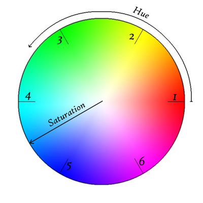
Looking at the wheel from farther away, the eye can see little triangles at the numbers. The colors are different through these triangles. The colors are indistinguishable when placed near each other. Placing a color in the 6 area next to a color in the 3 will certainly contrast, but that would be very jarring. Moving in from the edge a little, maybe 20% of the way in from the edge, the colors are less saturated, and the colors are more distinguishable. Selecting 2 greens in this area will likely be visible to the eye, and allow the users to distinguish between information presented using these colors.
There are theories about how to mix colors, using complementary and analogous colors. Following these theories can prevent users from feeling their eyes are assaulted. There are ways to use colors to set moods and to convey a sense of importance to information.
There are tools on the web for selecting colors to provide the right look. Many of the tools will put the basics there, and offer the chance to blend them to get the unique look desired.
Changing UIs
The best way to change what users like is to do it gradually. Never remove a feature. Emacs is a great example. Moden Emacs UI's include the familiar File menu, Edit Menu, ... ending with help. All the keyboard commands still work, and I can turn off the tool bar to get more edit space on my screen. All of the macros are available, and there are more, some I discover new. Adding functions is a good thing, but don't force the users to use them. The users know their tool/app and use it their way, maybe not the way it was designed, but certainly in a way that suits them
The user looks at an application as a tool. They have a problem and they need a solution. If your tool doesn't meet their needs, they will find another tool that does suit it. Maybe Excel wasn't intended to be a word processor, but some people will insist on using it to edit blocks of text. Let the user find the tool that suits them.
What is your favorite tool that someone has destroyed making it "better"?
No comments:
Post a Comment